With the latest Hanelly update, we are excited to announce a whole host of new features and enhancements.
At Nakisa we strive to be a leader in our field, therefore we understand the need to continually search for new ways to develop and improve our solutions. We listen to our clients’ needs and feedback and look to incorporate them in our ever-evolving product. With Hanelly you can already pull in your HCM data to view your organizational structures from multiple perspectives, assess key HR analytics, as well as plan and design organizational transformations. Now, with the latest Hanelly update, we are excited to announce a whole host of new features and enhancements.
New Look
We’ve made major improvements to the user interface to help users better understand and navigate through the solution. One such way is through the new Landing Page. When users log in, they will be directed to the landing page where they can see all the major components they have access to in Hanelly. This not only shows them what they can do in Hanelly, but provides ease of access.
To help new users understand the many functions (and icons) in Hanelly, when looking at an org chart, there is now an On-Screen legend which provides a brief description of each icon found in the application.
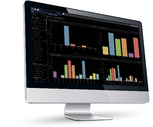
Another cool feature is the new Hanelly “Dark” Theme – ideal for display on large monitors that could be too bright when using the traditional Nakisa theme, the “dark” theme inverts the colors so it’s less strenuous on the user.
New Scenario Executive Summary
As we all know, when undergoing a change in your organizational design, it’s very important to keep track of the progress to ensure objectives are met. With Hanelly’s new Scenario Executive Summary, you will be able to view all of your team’s proposed scenarios. You will also be able to get an idea of the progress with helpful illustrative graphs, and see how close they are to their targets.
New Successor View
Expanding on succession planning features of Hanelly, there is now a new Successor View – a chart view that uses your HCM data to show the top 3 successors (if available) for each position in the org chart with their readiness and ranking.
New Chart Display Options
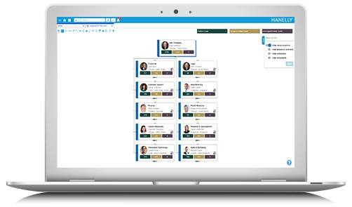
In Hanelly, there are already many different ways and perspectives to view your organizational structure. In response to customer feedback, we are introducing new chart display options that will allow users to apply filters to hide temporary contracts, contractors and consultants from being visible in their org chart – so they can more clearly visualize their permanent workforce.
New Icicle Chart
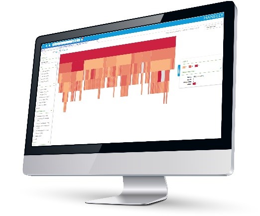
One exciting new feature is the icicle chart - which provides a detailed view of the different levels of your organizational structure based on numerous metrics. This visual representation of your data helps to immediately highlight areas where there are scarce skills, or risk of loss, helping you get a more in-depth understanding of your organization and make better, more informed decisions.
These are but a few of the new features and enhancements in the latest Hanelly update.
Want to learn more or see a demo? Get in touch by emailing info@intranetorgchart.com, or book a demo here.


