Written By:
Janetta McCreery
Technical Writer Nakisa Hanelly
Nakisa
Building on the significant updates of the previous release earlier this year, the latest version of Nakisa Hanelly strengthens the reputation of the leading organization charting and design solution on the market. Here are just a few of the developments, new features and enhancements we’re excited to introduce.
New Suite of Dashboards
By far, the most impressive new feature we’ve added in this release is our new suite of dashboards that help users understand their organization from many perspectives. We’ve added seven new dashboards for visibility into key metrics such as diversity & inclusion, succession planning and people analytics.
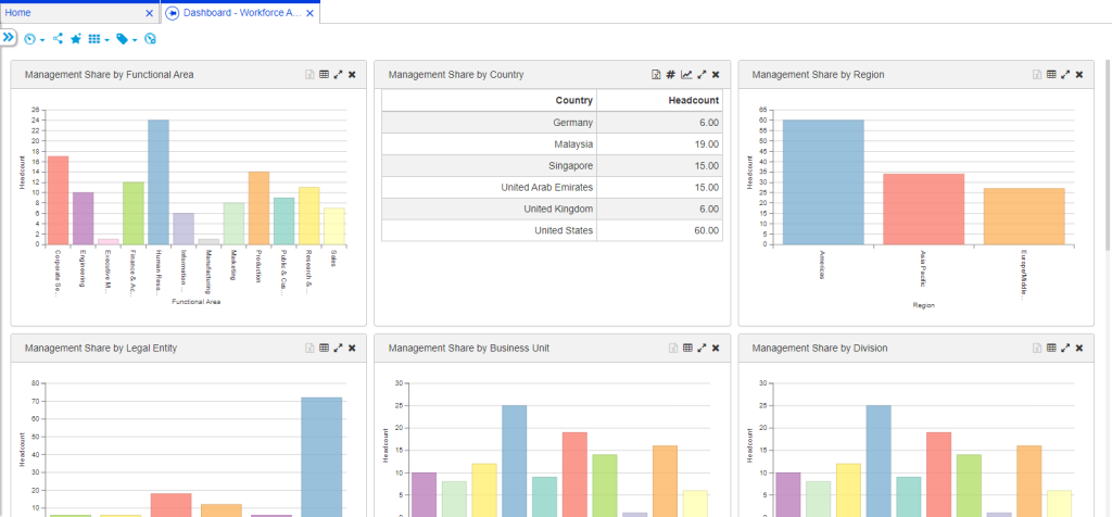
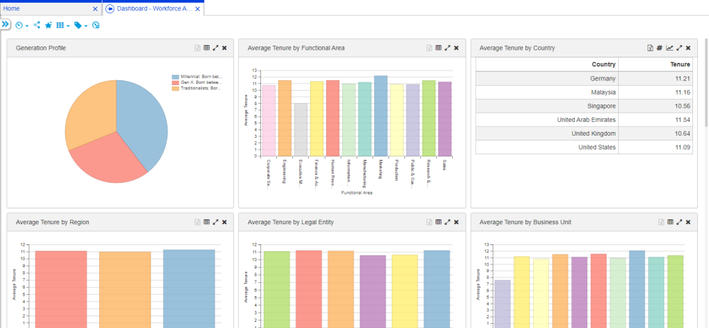
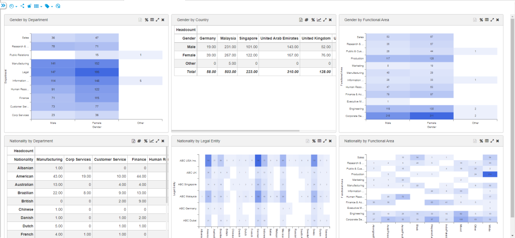
The new Diversity & Inclusion dashboards help users understand their organization’s composition, allowing them to analyze their management team and their whole organization on items such as management share, tenure and demographics based on elements like age, gender, and ethnicity. This dashboard set contains graphs for:
Management Share – this dashboard shows the diversity composition of the management team and its overall percentage of your organization
Tenure shows charts that help users understand the generational makeup of their organization
Demographics dashboard helps provide insight into the ethnic makeup of the company
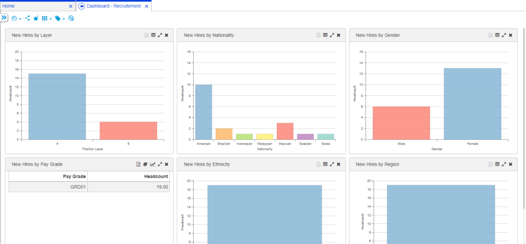
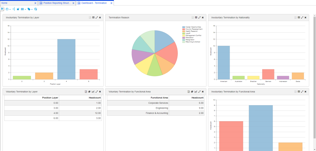
The People Analytics dashboards give users detail such as insight into the number of employees that were hired, left or let go, or transferred to a different role. These useful analytics help to identify potential knowledge gaps and problem areas caused by employee movement. This dashboard set contains graphs for:
Recruitment - providing insights into employees hired in the past 90 days, using charts with key attributes such as layer, pay grade, department, etc.
Termination dashboard helps analyze data about employees who left the company (voluntarily or involuntarily) to help retain talent and reduce turnover costs.
Transfers dashboard provides insights into knowledge loss when employees are transferred within the organization due to lateral moves, promotions, or re-location. This can help organizations focus on implementing preventive measures to problem areas.
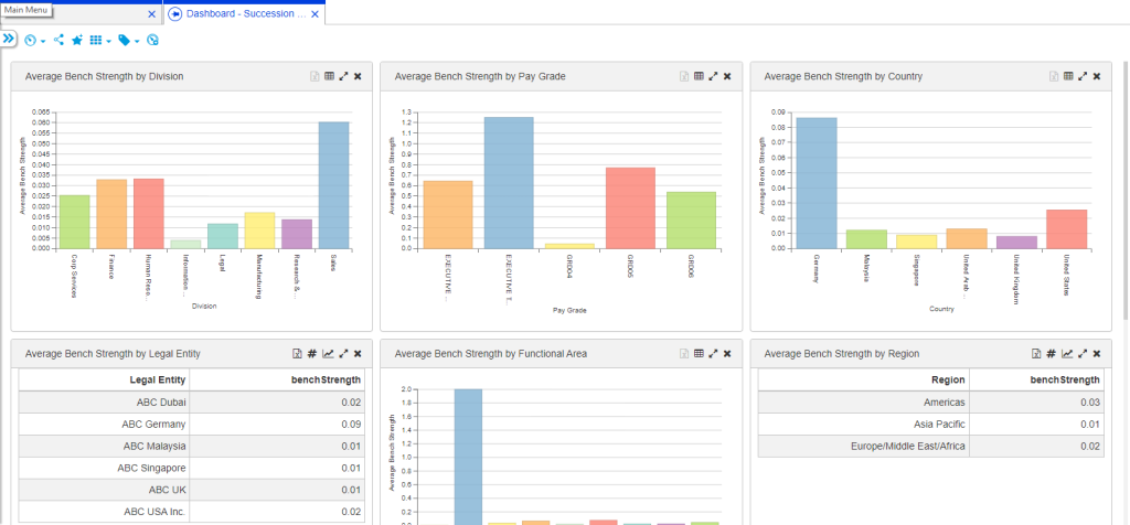
Succession Management – this dashboard set provides a better understanding of an organization’s bench strength using charts against key attributes such as functional area, country, department, etc. This dashboard set includes graphs based on key position and by bench strength.
Additional Dashboards
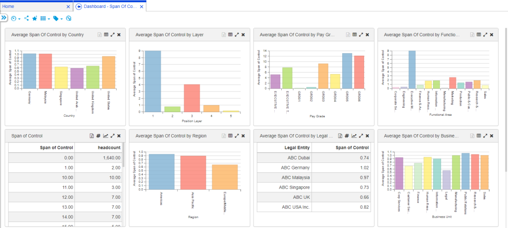
The new Span of Control dashboard uses charts with key attributes such as functional area, country, department, etc. to give users a better understanding into their organization’s span of control. This understanding empowers users to identify and focus on areas where span of control may need to be optimized to develop a more productive organization.
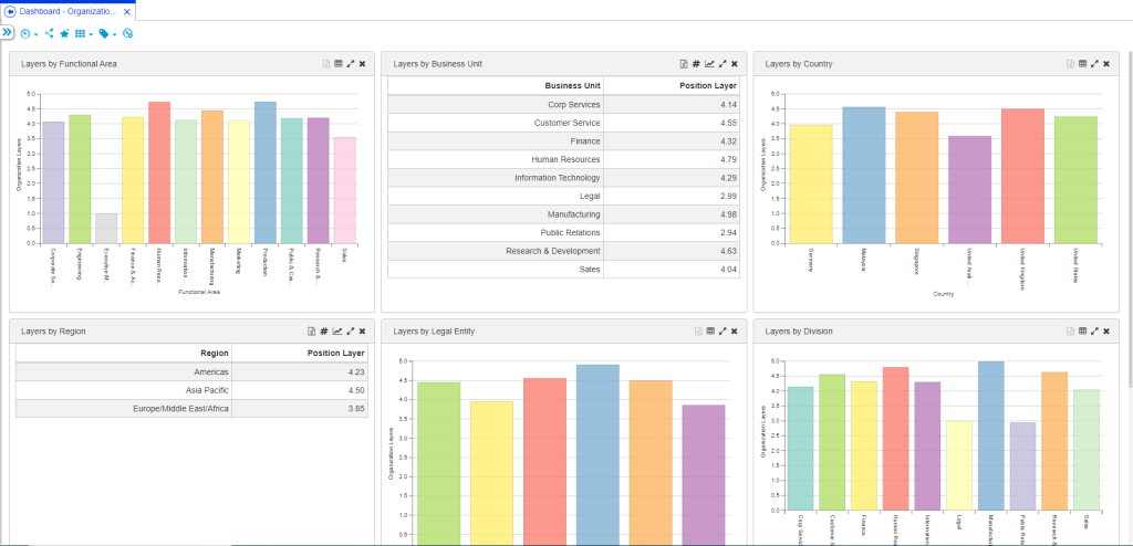
The Organization layers dashboard illustrates how an understanding of the number of layers in the organization can help users identify and focus on areas where layers may need to be streamlined to develop a more efficient organization.
Expansion of Custom Views
We’ve expanded the custom views functionality to allow users to automatically assign colors or custom icons to the nodes in their views. As an example, if after a series of mergers and acquisitions, a user wants to show their org chart with the nodes colored based on the company they were hired from originally, they can now do that in a custom view.Expansion of Custom Security Roles
In the last release, we introduced custom security roles. We have enhanced this feature to include more than one matching criteria. If there is a need for a user role that can access sensitive data for employees who share the same region and zodiac sign, users now have the power to create that themselves.
New Scenario Collaboration Models
We have also added two methods of sharing scenarios. In one model, scenario creators choose to share their entire scenario with their assigned team members. This will allow the assigned users to view and edit the entire scenario but can only see sensitive data when it is applicable to their roles.
In the other model, scenario creators can use a work area assignment sharing method, which allows you to assign work areas to different team members to complete. This model allows the scenario creator to create targets for the scenario, see analytics for each work area and department, and use the Executive Summary for the scenario. This collaboration model also contains a full scenario share option.
User Experience Enhancements
We’ve made a few tweaks to the application in our continuing efforts to provide a seamless user experience. To help with our efforts, there’s now a User Feedback module in the application. While you’re using the application, just pop open the Feedback window and give us a star rating and a quick description of how you’re feeling or what you need. It’s as easy as giving a Yelp review! With the feedback we have already received, we have made developments to drag and drop within scenarios, exporting lists and the employee map. Org chart printing has been revamped and there is now the option to view your org chart as employees reporting to other employees, instead of positions reporting to positions or org units.
For more information and to see the new features in action, please watch our Nakisa Hanelly October 2019 Release Video.